
why there are almost no navigation buttons
Most apps begin by asking where you want to go.
A tab bar. A menu. A settings icon. A back button.
Before doing the thing we came to do, we first choose where to be.
Palilili tries a different approach.
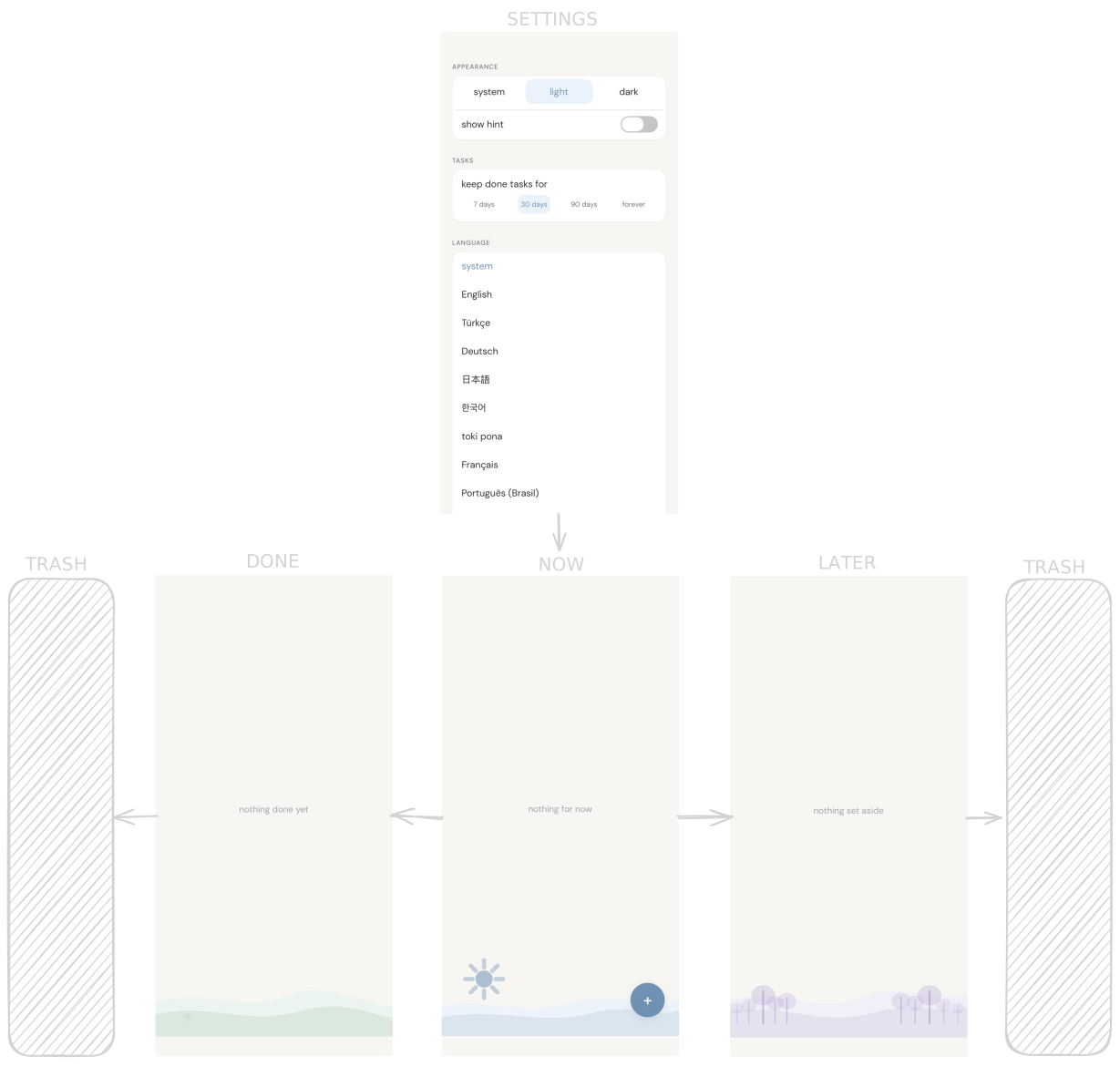
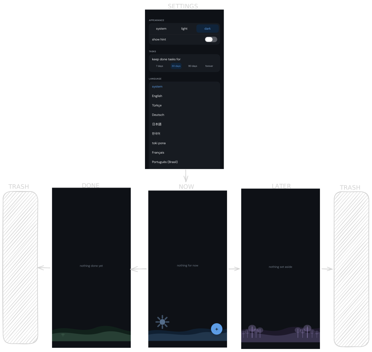
the main screen is the app
The list is not one section among many. It is the application.
When you open palilili, there is almost nowhere else to go. The only horizontal movement is between Done, Now, and Later because that movement is the work itself. It reflects changing priorities, not changing screens.
Nothing important is hidden behind another page.
settings stay out of the way
Settings still exist, but they are not part of the everyday experience.
Instead of taking a permanent place on the screen, they appear with a simple downward swipe. They are easy to reach when needed and easy to forget when they are not.
That small decision keeps the interface focused on the tasks instead of the application itself.
fewer decisions
Every visible button quietly asks a question.
Should I tap this?
Most of the time, the answer is no.
Removing unnecessary navigation is not about making an interface minimal for its own sake. It is about removing decisions that do not help someone finish what they opened the app to do.
The best navigation is often the one you stop noticing.
When the interface asks for less attention, it leaves more of it for what matters now.